Sunday, September 28, 2014

Fixed header on scroll

Having fixed header is very user friendly to any website and these below steps will show you how to have a fixed header with minimum steps. And there is an fiddle example at the bottom of this post.

fixed navigation header on page scroll


For this example, I am creating navigation header and a table below it in a html file.

Note: Bootstrap css has been used for navigation and datatable.

 Bootstrap CDN available here :

//maxcdn.bootstrapcdn.com/bootstrap/3.2.0/css/bootstrap.min.css


Step 1:
  Create a html file and add simple navigation header and wrap it in a div block with a class name as 'navigation'
<ul class="nav nav-pills">
  <li class="active"><a href="#">Home</a></li>
  <li><a href="#">Profile</a></li>
  <li><a href="#">Messages</a></li>
</ul>

Step 2:
   Create a simple datatable with the below code and put it in a div with class name as 'datatable'
<table class="table table-condensed table-bordered">
       <thead>
           <tr><th>Head1</th><th>Head2</th></tr>
       </thead>
       <tbody>
           <tr><td>Col1</td><td>Col2</td></tr>
           <tr><td>Col1</td><td>Col2</td></tr>
           <tr><td>Col1</td><td>Col2</td></tr>
           <tr><td>Col1</td><td>Col2</td></tr>
           <tr><td>Col1</td><td>Col2</td></tr>
           <tr><td>Col1</td><td>Col2</td></tr>
           <tr><td>Col1</td><td>Col2</td></tr>
           <tr><td>Col1</td><td>Col2</td></tr>
           <tr><td>Col1</td><td>Col2</td></tr>
       </tbody>
</table>

Step 3:
   Now, add custom styles to your html code either in the same file or add it as an external css file

// Style to Navigation block.
.navigation {
    padding:8px; /* Some space around navigation pills */
    position:fixed; /* IMP.This makes the div fixed and cannot to moved*/
    top:0;          /* This will set the top edge position*/
    border:1px solid green; /* I Just gave it to differentiate between table and header*/
    background:#fff; 
    width:100%;    /* Occupies 100 percent of the page width*/
}
// Style to Datatable block
.datatable {
    margin-top:60px; // Top edge margin
}


At the end of step 3, you should be able to scroll the table with header as fixed (Note: For scroll bar to appear, the height of the browser should be less than the height of the page content. In our example browsers height should be less than table's height.)

 Fiddle available for this example here : http://jsfiddle.net/94hnes36/


Friday, June 6, 2014

Simple Sign In Form using html and css


The first and foremost graphical interface for any application is a login form or sign up form. It is very important that we make sign in forms attractive. You can create them easily with html and css.

Here is one simple example login in form using html and css

Simple sign in form with username and password fields
Simple sign in form with username and password


The html part :
<div id = "signUpForm" class = "center">
    <div id = "avatarHolder" class= "center">
      <img class = "avatar" src = "http://imagizer.imageshack.us/v2/100x100q90/837/ota1.jpg" />
    </div>
   
    <div id = "form" class = "center">
        <input id = "email"  placeholder= "Email"/>
        <input id = "password" type = "password"  placeholder = "password"/>
        <button id = "signIn">Sign in </button>
    </div>
</div>


The CSS style part


#signUpForm {
    width : 100%;
    max-width : 300px;
    height : auto;
    background-color : #ddd;
    padding: 20px;
    box-shadow : 0 3px 4px #aaa;
}
#avatarHolder {
    width : 90px;
}
.avatar {
    height : 90px;
    border : 1px solid #bbb;
    width : 90px;
    border-radius : 90px;
}
#form {
    width : 200px;
   padding: 10px;
}
#form input {
    line-height : 2;
    width : 100%;
    border-radius : 5px;
    border-style : none;
}
#form button {
  background-image:linear-gradient(#6D94BF, #446E9B 50%, #3E648D);
  border:1px solid #345578;
  padding:8px 12px;
  text-align:center;
  vertical-align:middle;
  white-space:nowrap;
  color : #FFF;
  width : 100%;
  border-radius : 5px;
  margin-top: 10px;
}

.center {
    margin-left : auto;
    margin-right : auto;
}


Place the html part between the body tags and place the css in your css file or in between style tags and your html should look like as shown in the picture above


There is fiddle available for this html sign-in form here


Wednesday, May 14, 2014

How to call jquery function from JSP page conditionally

Sometimes we might need to write a jquery function in jsp page and we might need to call it only when it is required or based on certain conditions.

Say we have a boolean attribute based on which we have to call jquery function.

Setting an attribute on server side


We set an attribute on server side using
 req.setAttribute("myAttribute", true);  // On Server Side

on jsp page use <% % > tags to write java code and get that attribute.

Getting attribute in JSP


<%  boolean myAttribute = (Boolean)req.getAttribute("MyAttribute") %>


Now, if that boolean is true write your jquery script.

Calling Jquery function in JSP


<%  if( myAttribute) {%>
<script>
   $(function () {
      alert("Called Jquery from JSP conditionally")
})
</script>
<%}%>


Or you can use taglib library

Example for calling jquery in JSP:


 <c:set var="myAttribute"  value="${5}"/>
<c:if test="${myAttribute< 10}">
  <script>
   $(function () {

       alert("Called Jquery from JSP conditionally");
   });
  </script>
   Variable <c:out value="${myAttribute}"/>

</c:if>


How to make divs responsive-Creating simple responsive design

It is now became necessary for every website to be responsive to different platforms like mobile, tablet and desktop. Creating fluid or responsive design is made easy CSS3 media queries.

In this post we will see how to create a simple responsive design using media query.


1. Lets create two div blocks in a simple html page


<!DOCTYPE html>
<html>
<style>

#container {
  width : 610px;
}

.holder {
  width : 300px;
  height : 300px;
  border : 1px solid red;
}

</style>
<body>
    <div id = "container"> 
    <div class = "holder">
     MY CONTENT IN DIV 1
    </div>
    <div class = "holder">
     MY CONTENT IN DIV 2
    </div>
   </div>
</body>
</html> 


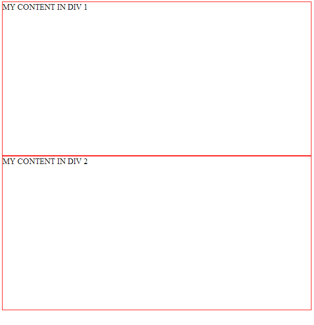
If you execute the above code you will see something like below.


Simple Responsive Design Image 1
Fig.1 : Shows general div blocks with defined width and height of 300px

2. We need these div blocks to be side by side intially. So we will add some css properties to place them in one row.

Replace the holder class style with the below one. 


.holder {
width : 300px;
height : 300px;
border : 1px solid red;
display : inline-table;
float : left;
}


Now our divs should look like this

Simple Responsive Design Image 2
Fig.2 : Shows div blocks aligned in one row(aligned side by side)

3. Now, the two divs total width is 600px(i.e 300px + 300px). Lets say any device/browser width which is less than that, we want them to be in one column 

So, now using media query in our css we will change the css properties of the divs when the browser width is less than 600px.

     a) Change container width to 100%
     b) Change holder width to 100%
     

@media (max-width: 600px) 
{
 #container {
     width : 100%;
  }
 .holder {
     width : 100%;
  }
}
Thats it, if you include media query section in your style sheet, the result div blocks willl look like below for devices/browsers that are less than 600px width.


If you have any questions regarding this post, please post them in the comments section. I will reply as soon as possible. 


Saturday, May 10, 2014

YUI 3 Charts - How to display custom labels for axes


YUI 3 is the one of the best opensource javascript framework that I found to use for my clientele requirements.

YUI 3  provides good auto labeling for charts, but occasionally those labels will be not be good. In such cases we can customize the labeling for chart axes.

 In this post I would like to explain the work around to fix labeling problems.

Lets start with creating a simple DOM element to hold our chart and apply basic styles to it.
<style>
#myChartHolder {
    margin:10px 10px 10px 10px;
    width:90%;
    max-width: 800px;
    height:400px;
}
</style>

<div id="myChartHolder">
</div>


We need YUI 3 library for working on any charts. So just point to the latest YUI library in the html header section(i.e between <head></head> tags). Say,

<script src="http://yui.yahooapis.com/3.16.0/build/yui/yui-min.js">
</script>


Now to render the basic chart with minimum data we use YUI's "use" method, pasted below with example data

<script>
YUI().use('charts', function (Y) {

     var myAxes = {
            totals:{
                keys:["total"],
                position:"left",
                type:"numeric",
                styles:{
                    majorTicks:{
                        display: "none"
                    }
                }
            },
            dateRange:{
                keys:["date"],
                position:"bottom",
                type:"category",
                styles:{
                    majorTicks:{
                        display: "none"
                    },
                    label: {
                        rotation:-45,
                        margin:{top:5}
                    }
                }
            }
        };

 var accountsGraph = new Y.Chart({
  dataProvider: [{"date":"July","total":"1"},
        {"date":"August","total":"1"},
        {"date":"September","total":"1"},
        {"date":"October","total":0},
        {"date":"November","total":"1"},
        {"date":"December","total":0},
        {"date":"January","total":0},
        {"date":"February","total":0},
        {"date":"March","total":0},
        {"date":"April","total":0},
        {"date":"May","total":0},
        {"date":"June","total":0}],
  render: "#myChartHolder",
  type: "column",
  categoryKey: "date",
  axes:myAxes,
  horizontalGridlines:true
 });
});
</script>


When you execute the above script, the result html chart would look like this,


If you observe the labels of the left Y-axis, some of the numbers are not good and we definitely do not want something like that.

In order to avoid any such long decimal or to replace with any custom content, we are gonna use  "labelFunction" parameter.

In this function, we will force the decimal places to take only one using javascript's native function ".toFixed()".

In the axes definition, we have two variables "totals"(Y-axis) and "dataRange"(X-axis). Place the customLabel function for "totals" like below in between position and type parameters.

position:"left",
 labelFunction: function (val) {
                var display = val.toFixed(1);
// 0.9999999887 will be 0.9
                    return display;
                },
 type:"numeric",


If you execute the whole code, now your html result YUI chart should look like this.


Now that solves our problem for labeling errors in YUI 3 charts. If you have any questions, you can post them as comments, I will reply as soon as possible.


Thursday, March 27, 2014

How to position image with css


If you want your image permanently positioned on your page, you can use css property called "position" with its value as fixed


//HTML
<img alt="Displaying image at corner using css property 
position" class="topLeft" src="http://imagizer.imageshack.us/v2/100x75q90/844/ybfp.jpg" />


<img alt="Displaying image at corner using css property 
position" class="topRight" src="http://imagizer.imageshack.us/v2/100x75q90/844/ybfp.jpg" />

<img alt="Displaying image at corner using css property 
position" class="bottomLeft" src="http://imagizer.imageshack.us/v2/100x75q90/844/ybfp.jpg" />

<img alt="Displaying image at corner using css property 
position" class="bottomRight" src="http://imagizer.imageshack.us/v2/100x75q90/844/ybfp.jpg" />


//CSS 

img {
position:fixed;
}

.topLeft {
top:0;
left:0;

}

.topRight {
top:0;
right:0;

}

.bottomLeft {
bottom:0;
left:0;

}

.bottomRight {
bottom:0;
right:0;

}

Here is the fiddle for positioning images with css http://jsfiddle.net/hSq3b/1/


Wednesday, March 26, 2014

How to avoid wrapping in html or css.


Wondering how to avoid wrapping in html or css. 

You can use css property "white-space"  to prevent wrapping in html or css


Below is the example 

Say your content is like this 

<p>
My Content My Content My Content My Content My Content My Content My Content My Content My Content 
</p>


// CSS
p{
white-space : nowrap;
}

Here is the fiddle for the same :  http://jsfiddle.net/4Fty3/

Monday, March 24, 2014

How to increase or decrease height of an element by clicking another element


1. Create a div which holds the main container


<div id= "main">
//This is your main container
</div>

2. Create a div which holds the content and place it in the main div like below


<div id = "main ">
    <div id = "content">
        <p> My content line 1</p>
        <p> My content line 2</p>
        <p> My Content line 3</p>
    </div>
</div>


3. Now, create another div which will have a button to control the div with content. In my case I am calling it as "footer" and place it in the main div

after placing the footer div the whole  html code should look like this


<div id= "main">
  
    <div id = "content">
        <p> My content line 1</p>
        <p> My content line 2</p>
        <p> My Content line 3</p>
    </div>
    <div id = "footer">
        Footer
        <button id = "btn">Button</button>
    </div>
  
</div>


And the css for these elements is 


html,body {
   height:100%
}
 
# main{
    min-height:100px;
    border:1px solid grey;
    height:100%;
}
#content {
    border:1px solid black;
    display:block;
    overflow:hidden;
    overflow-y: scroll;
}
#footer {
    border: 1px solid blue;
    display:block;
    //If you want to place your footer at the bottom and not to move it
    bottom:-10px;
    position:absolute;
}
NOTE : If you do not wish to move your bottom 
I have used jquery, so I am going to use click function from jquery to handle click events on the footer button that we have created in step 3. And also change the height of the content element with jquery css function
$(function () {

    $('#btn').click(function(){
   
        $('#content').css("height", "100px");
    });
   
})
In this example I created only one button with handles reduces the height of the "content" div.
You can add another button to increase the height of the content div/element.


If you want some smoother action, you can use jquery animate https://api.jquery.com/animate/   like this

$(function () {

    $('#btn').click(function(){
    
        $('#content').animate({
            height:"20px"
        }, 2000);
    });
    
})


Here is the fiddle http://jsfiddle.net/mannemvamsi/DYZr5/4/